- 1.1 a) The individuals are vehicle models.
- b) The categorical variables are "Make and Model,"
"Vehicle Type" and "Transmission Type." The quantitative variables
are "Number of Cylinders," "City MPG," and "Highway MPG."
- 1.2 a, c, and d are categorical, b, e, and f are
quantitative.
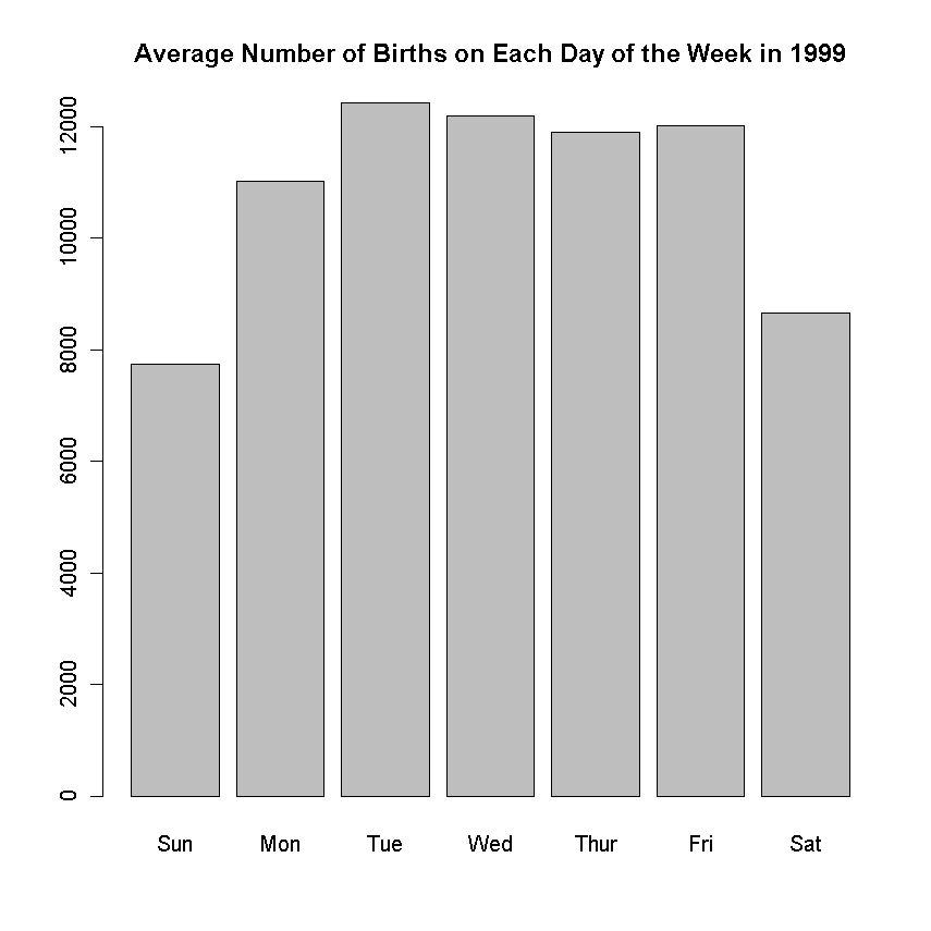
- 1.4
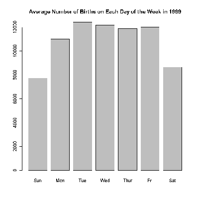
- Although this data could be presented in a pie chart if it were properly converted
to percentages, it is most appropriate to display the information in a barplot.
Possible reasons why there are fewer births on weekends will vary. One possible answer
is the effect of scheduled births (induced labor and c-sections).
- 1.5
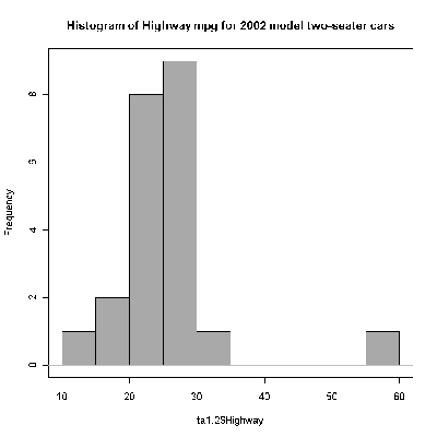
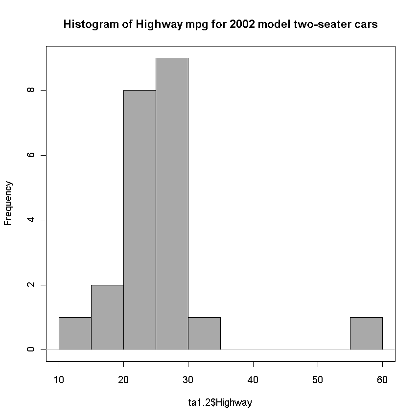
- 1.6

- a) The distribution center looks to be around 26
miles per gallon. In the histogram, the data look a little bit skewed
to the left, but that is entirely due to two vehicles, so it would
probably be better to say that the data were pretty symmetric. There
is not a lot of spread in this data, with most values within 2 mpg of
26.
- b) It appears that the Lamborghini and Ferrari are most
likely to be hit with the guzzler tax.
- 1.8
- 10 | 139
11 | 5
12 | 669
13 | 77
14 | 08
15 | 244
16 | 55
17 | 8
18 |
19 |
20 | 0
- 200 appears to be an outlier. The center of the distribution is 137 and,
ignoring the outlier, the spread of the data is from 101 to 200.
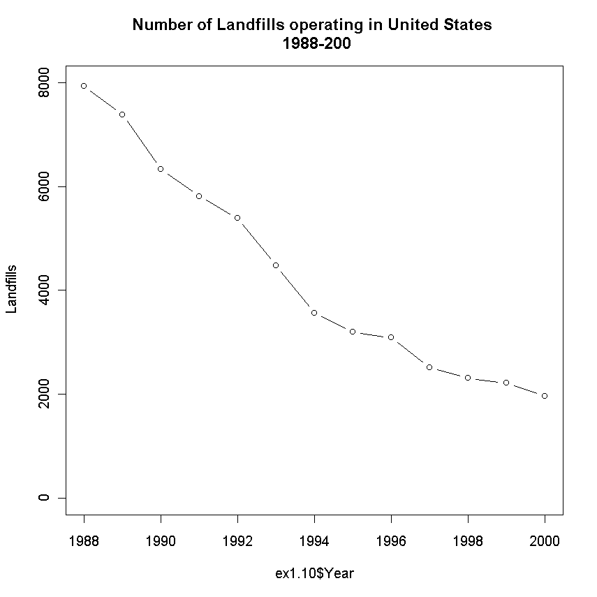
- 1.10
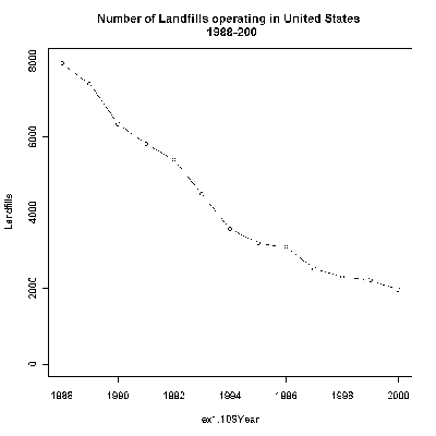
The number of landfills is decreasing, which may indicate limited space
available for garbage. Recycling could be an effective way of reducing the amount
of garbage that needs to be placed in a landfill.
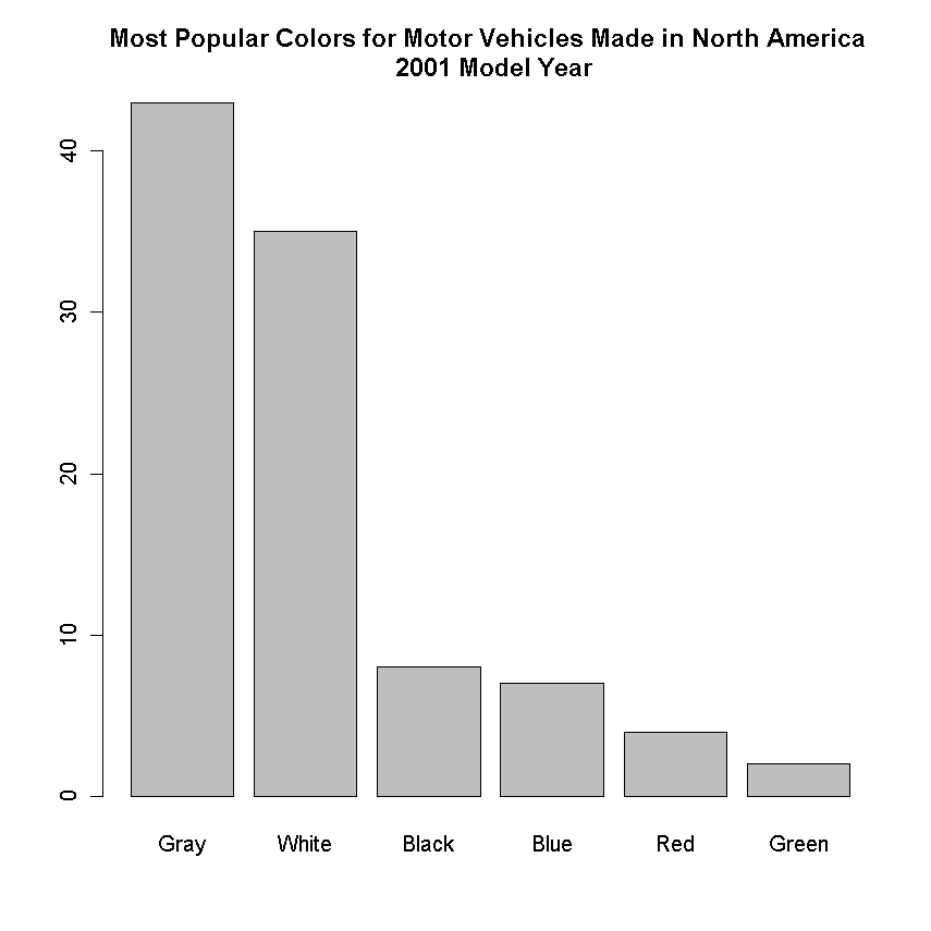
- 1.11 100-43-35-8-7-4-2=1.
1 percent of Japanese cars have other colors
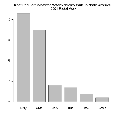
The most important difference between choice of vehicle color in
Japan and North America is that the Japanese have much less variety in
their color choices. The vast majority of cars in Japan are white or
gray. In North America, the top two color choices still do not account
for even 50 percent of the total.
- 1.15 It appears that 60 percent of US Hispanics are Puerto
Rican and 10 percent are Mexican.
- 1.16 The distribution is skewed to the right with the center
at about 3 or 4 servings per day. There is a fair amount of spread
given the obvious practical limitations on how much one person can
eat per day, but most of the individuals consumed less than 3 servings
per day. (15+11)/74 = 35 percent ate fewer than two servings per day.
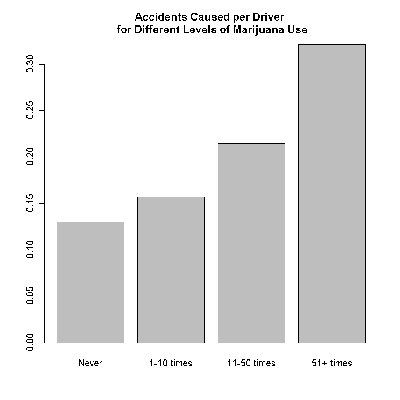
- 1.19
- a) The category with the most drivers will tend to have the
most accidents just because there are more people to get into accidents.
By comparing the rates, we can see how likely it is that an individual
in a given category will get into an accident.
- b) It seems that increased marijuana smoking is associated
with an increase in the rate of causing accidents while driving.
- 1.21 1:d (two categories, somewhat even), 2:b (basically symmetric),
3:c (two categories, 0 much more common than 1), 4:a
- 1.22
The dates of coins should be skewed to the left because no coins
will have dates from the future, most coins will have dates within a
few years of the present, but there will be smaller numbers of coins
that are from further back in the past.