4.1, 4.2, 4.4, 4.5, 4.6, 4.9, 4.12, 4.14, 4.17, 4.19, 4.22, 4.27, 4.30
- 4.1
- a) Explanatory Variable: amount of time studying
Response Variable: grade on exam
- b) Explore the relationship
- c) Explanatory Variable: inches of rain in growing season
Response Variable: yield of corn
- d) Explore the relationship
- e) Explanatory Variable: family income
Response Variable: years of education completed by eldest child
- 4.2 The explanatory variable is water temperature and
the response variable is weight gain of the coral. In this case, the
water temperature would be categorical and the weight gain quantitative.
- 4.4
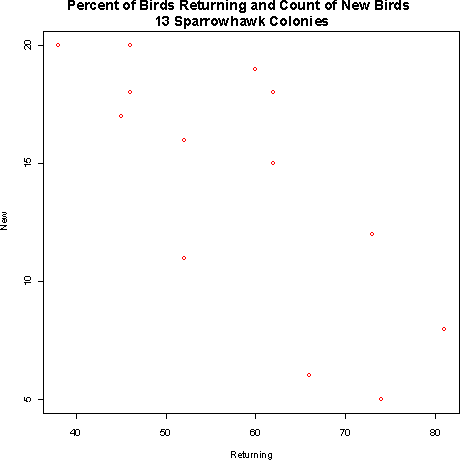
- 4.5 The relationship between the number of new sparrowhawks
and the percentage of returning birds looks like it is linear,
moderately strong, and negative. Based on the information given,
the sparrowhawk appears to be a longer lived territorial bird.
- 4.6
- a)
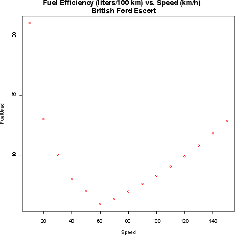
The explanatory variable is speed.
- b) Fuel consumption decreases as the speed increases from
0 to 60 then it starts increase again. This makes sense because a
certain amount of fuel must be used just to keep the car running. At
slow speeds it takes much longer to go a given distance. Much of the
fuel use at these speeds is from keeping the car running for that time.
As speed increases beyond the optimal point, wind resistance gets
stronger and stronger, so the increasing amount of gas required to
keep the car going so fast gets to the point where it is far more
significant than the reduction due to less driving time.
- c) There is negative association between speed and fuel
consumption for low speeds and positive association for high speeds.
Therefore it would be incorrect to say that speed and fuel consumption
were just positively or negatively associated.
- d) The relationship looks quite strong. It is easy to
see how a smooth curve would pass through all the points.
- 4.9
- a) The correlation between the percent of returning birds
and the number of new birds is -.7485.
- b)
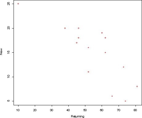
The new correlation with point (10,25) added is -.807
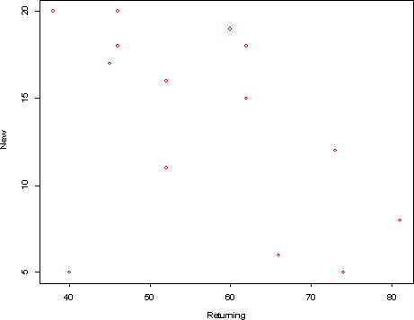
The new correlation with point (40, 5) added is -0.469
- c) The point (10,25) lies along the same trend line as the
original data, so it tends to strengthen the linear relationship, that
is make the correlation stronger. The point (40,5) lies outside the
trend line of the original data, so it tends to weaken the linear
relationship.
- 4.12
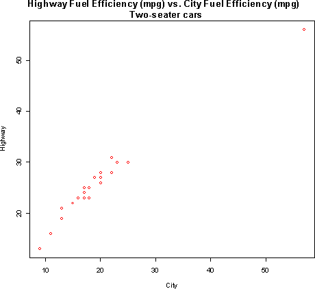
There appears to be a strong linear relationship between fuel
efficiency in the city and fuel efficiency on the highway. The
Honda Insight is an outlier that extends the pattern shown by the
other cars.
- 4.14
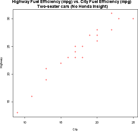
The correlation without the Honda Insight is .963. This indicates
that there is a strong linear relationship between the two variables.
It is easy to see evidence of this relationship on the scatterplot.
The Honda Insight should increase the correlation since it is in line
with the pattern formed by the rest of the data. The correlation
of all 22 vehicles is .981.
- 4.17
- a) The correlation for the data in figure 4.6 is clearly
positive but not near 1. There is a clear positive linear trend that
can be seen in the scatterplot, but the points are not tightly clustered
on a line, so the correlation will not be near 1.
- b) The correlation for the data in figure 4.7 should be
closer to 1 than the correlation for the data in figure 4.6. This is
because there appears to be less spread away from the line that would
pass through the data.
- 4.19 Removing the outliers from figure 4.6 will increase
the correlation as they are pretty clearly not in line with the trend
of the rest of the data. Removing the outliers from figure 4.7 may
decrease the correlation since the one outlier is roughly along the
same trend line as the rest of the data.
- 4.22
- a) There should be a positive correlation between tail
length and weight because tail length should be positively related
with the body length of the rat. Rats with longer bodies will tend
to be heavier than those with shorter bodies.
- b) 9.8/2.54 = 3.86 inches.
- c) The correlation would be 0.6 even if the length were
in inches rather than centimeters.
- 4.27
- a)
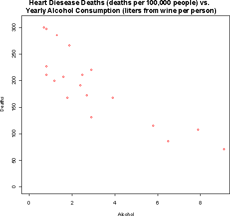
- b)The relationship appears to be quite strong and more or
less linear. Increased alcohol consumption from wine is associated with
lower death rates due to heart disease.
- c) The association is negative (increase alcohol is
associated with decreased death rates). This data does not provide
strong evidence that drinking wine causes a reduction in heart
disease deaths. There could be lurking variables that are associated
with both. For example, it may be that people who drink wine also tend
to eat more fruits and vegetables.
- 4.30
- a) Correlation cannot be calculated unless both variables are
quantitative. Gender is categorical.
- b) Correlation cannot be greater than 1.
- c) Correlation is a unitless measure, so it does not make
sense to have a correlation in bushels.